
The advice about AI and text in images is out of date
The received wisdom on image models and text goes like this: don’t. Generate the artwork, leave a gap, set the type yourself in something that can spell.
It is good advice. It has been good advice for about three years. I ignored half of it last week and got this on the first attempt.
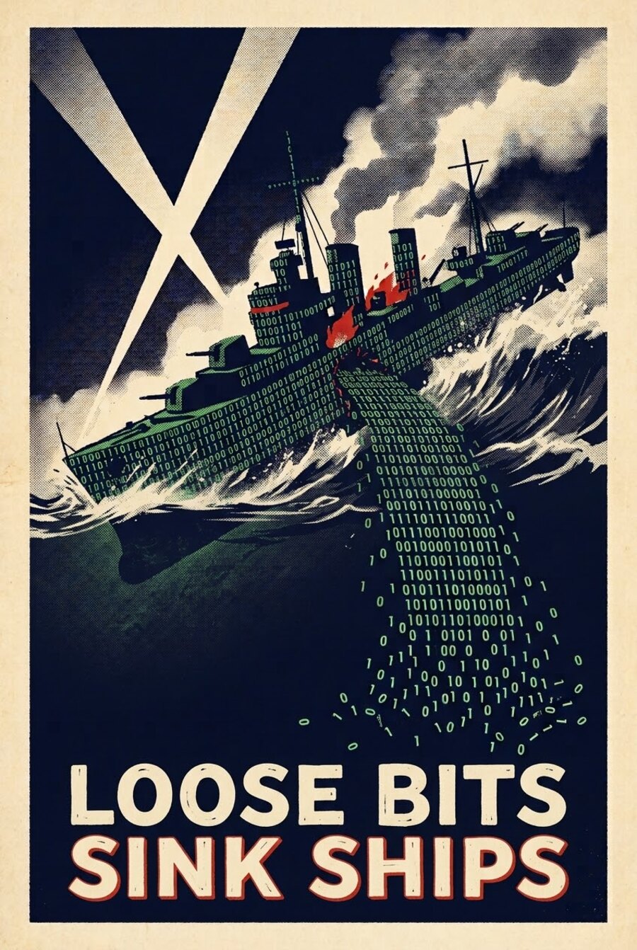
“Loose bits sink ships”, a play on the 1942 wartime slogan. I wanted it for a post about the small ways businesses leak data, and the joke only works if the words are actually on the poster.
What I expected to happen
I expected “LOOSE BITS SINK SHIPS” to come back as “LOOSE BTIS SNIK SHIPS”, or with a fifth word invented out of nowhere, because that is what image models have always done with lettering. Diffusion models learned what text looks like rather than what it says, and the result reads fine out of the corner of your eye and falls apart when you focus.
I also had recent form for expecting the worst. About six months ago I asked Gemini to lay out a family montage, five of our own photos arranged on a single A4 page. I supplied the images. It handed back a page where three of the five had been quietly redrawn: our faces blended into each other, and the children returned as sort of averaged, generic kids who were nobody in particular. Nothing was glitched or corrupted. It was confidently, cheerfully wrong, and genuinely odd to look at.
Which is the same failure as the garbled lettering, now I think about it. Faces and words are both things where approximately right is no use at all. A model that has learned the general shape of a face, or of a word, will produce something face-shaped or word-shaped and be perfectly satisfied with it.
So I asked Claude for two prompts: one that generated the art with deliberate empty space at the bottom so I could set the type myself, and one that had a go at the slogan. I fully expected to use the first.
Gemini got it right. Both lines, correctly spelled, kerned sensibly, in a condensed poster face, with the second line in red and a letterpress edge on it. I have since run it a few more times and it has not misspelled it once.
What I think actually did the work
Not the model alone. The prompt was unusually specific, and I think three things in it mattered.
It described construction, not just subject. Not “a ship made of binary” but that the hull, funnels, masts and turrets are each built from 1s and 0s packed together, legible close up, reading as a solid silhouette from a distance. That is a hard instruction to fudge, and you can see the model actually obeyed it: zoom in and the hull plating is digits.
It named a printing process. “Offset lithograph, heavy halftone grain, slight ink registration offset, aged cream paper”. Models respond far better to a named process than to an adjective like “vintage”. The red is very slightly out of register against the cream, which is the detail that sells the whole thing.
It said where the words go and nothing else. The slogan was described as a block in the lower third, with the explicit instruction that there be no other text anywhere. Most of the garbled lettering I have seen comes from models cheerfully adding signage, mastheads and watermarks nobody asked for, and then running out of attention for the bit that matters.
The bit that is still true
I would not bet a client deliverable on this. Four short words in a fixed position is close to the easiest case there is. A paragraph, a price list, a set of feature labels: still a bad idea, still faster to set yourself.
But “never let it do the text” has quietly become “check whether it can, because it might”. That is a different rule, and if you have been batch-adding type by hand out of habit it is worth retesting your assumptions.
The poster is doing its real job over on the agency site, attached to a post about the small leaks that sink small businesses, which is the argument I actually wanted to make. This bit was just the fun part.